
Student Lunchbox
User Experience & Mobile Design
January-March 2024
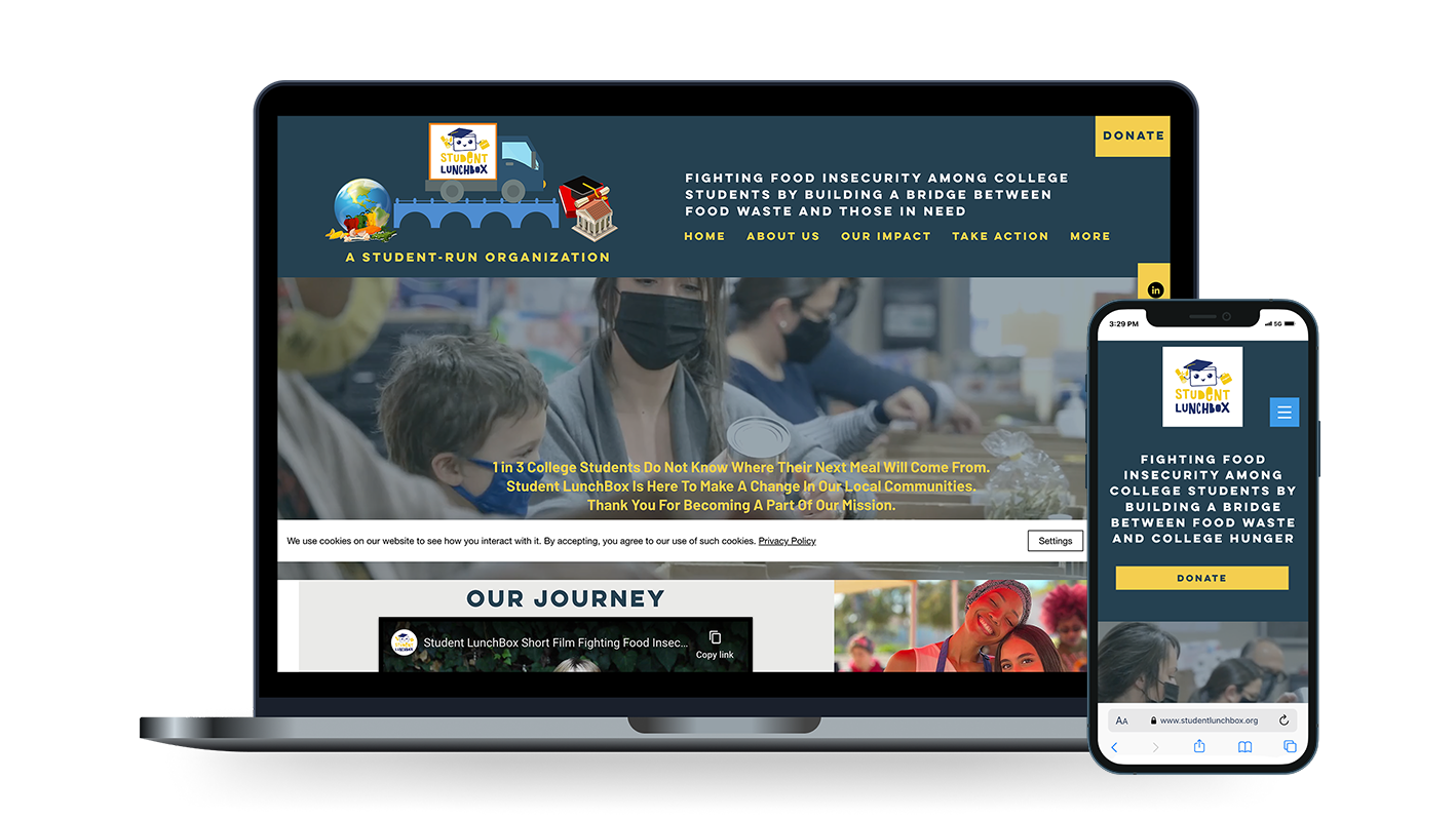
Student LunchBox is a non-profit organization that addresses food insecurity among college students. Their mission is to ensure no student faces academic challenges on an empty stomach by building partnerships with local businesses and community members to rescue excess food and redistribute it to students in need. The task …
Meet accessibility standards ensuring a user-friendly design
Redefine the mobile user experience utilizing responsive design
Optimize the donation process for various donor types
Address and solve for trust issues that users experienced when viewing the donation platform, food distribution process, and pathways for students
The approach…
I developed stakeholder questions, and then conducted an interview with Karlen Nurijanyan, CEO of Student LunchBox. He highlighted the crucial issue of food insecurity and shared personal experiences that shed light on the profound impact of his organization's work. Following this interview, I utilized the five core stages of human-centered design thinking process, to better understand and address the challenges of the current site for users, and develop solutions for them.

What was observed and how it was addressed
-
The organization wanted to ensure that site visitors were clear on the mission of Student LunchBox. They also wanted to grow the amount and kind of donations that they receive.
Donations are the backbone of the success of their goal to ensue college students do no go hungry while trying to achieve academic success. -
Visitors to the Student LunchBox website were unsure how and where to find the content they were looking for quickly and easily, whether they were a volunteer, someone making a donation, or a student seeking assistance.
This could lead to additional stress and worry, and a solution was needed to streamline content for all users visiting the website.
The mobile experience was also particularly challenging as the content was designed for a desktop experience, and was not mobile friendly.
-
Update the navigation so that each menu item is clearly defined and easily understood
Improve the way that the content is organized on the website so that is easier to find
Remove any barriers that prevent people from making donations due to questions of trustworthiness
Update the design and language throughout for donors, college students seeking assistance, and volunteers
Review the ways competitors have their site content organized and the overall user flow
Compare uses of color using an accessibility checker to ensure site passes Web Content Accessibility Guidelines
Review donation platforms and volunteer sections on other sites and incorporate best practices
Update heading structure to improve Search Engine Optimization (SEO)
Design Thinking Process…

Empathize
User Interviews
Stakeholder Interviews
Desktop Research
Competitor Analysis
Define
Personas
Problem Statement
User Journey Maps

Ideate
Sketching
How Might We Statements
Rapid Ideation
Prototype
Low-Fidelity Wireframes
High-Fidelity Wireframes

Test
Validate ideas
Refine Designs
Iteratively Build
Research Methods…
I employed a variety of techniques and an iterative approach to understand and address target users' needs, pain points, and behaviors, which informed design decisions. These techniques included both qualitative and quantitative approaches, such as user interviews, usability testing, contextual inquiries to identify areas of friction and improvement, surveys, and competitive and comparative analysis. My aim was to create user-centric designs that optimize the user experience by putting users at the center of the design process and actively gathering data about their needs and behaviors through these research methods.


What was observed and how it was addressed
-
To better understand the reasons behind users' actions and experiences, I planned and conducted effective interviews with members of the target audience which was donors age 35+ living in the United States.
I also wanted to gauge the perspective of someone outside of this audience who might come across the site organically with the intention of making a donation. This involved recruiting participants from my own network and inviting them to take part in user surveys.
Based on the survey results, I analyzed the data and developed questions to ask during usability tests, where participants navigated the site. The feedback and candid discussions allowed me to identify key themes and areas for improvement after synthesizing the results. -
I gathered information and insights from existing data and sources to make informed decisions about my designs. Specifically, I researched organizations that address food insecurity, reviewed articles, as well as blogs and posts from people who have experienced it.
I looked into what they find beneficial and the things they wished for but rarely encountered. Additionally, I examined the challenges college students face when balancing academic schedules while trying to support themselves, either full-time or part-time. I also investigated what food pantries offer, the challenges they encounter, and the items that are often lacking. This research informed my design decisions and provided guidance for the Student LunchBox project. -
I researched competitors to gain insight into their products and marketing to identify gaps in Student LunchBox's strategy.
By contrasting and comparing what other organizations were doing well, I was able to identify both weaknesses and strengths. This allowed me to incorporate those findings into my own design in order to improve on top of what’s already been done.
Companies I explored included Feeding America, and Replate, both which address food insecurity and have donation platforms.
-
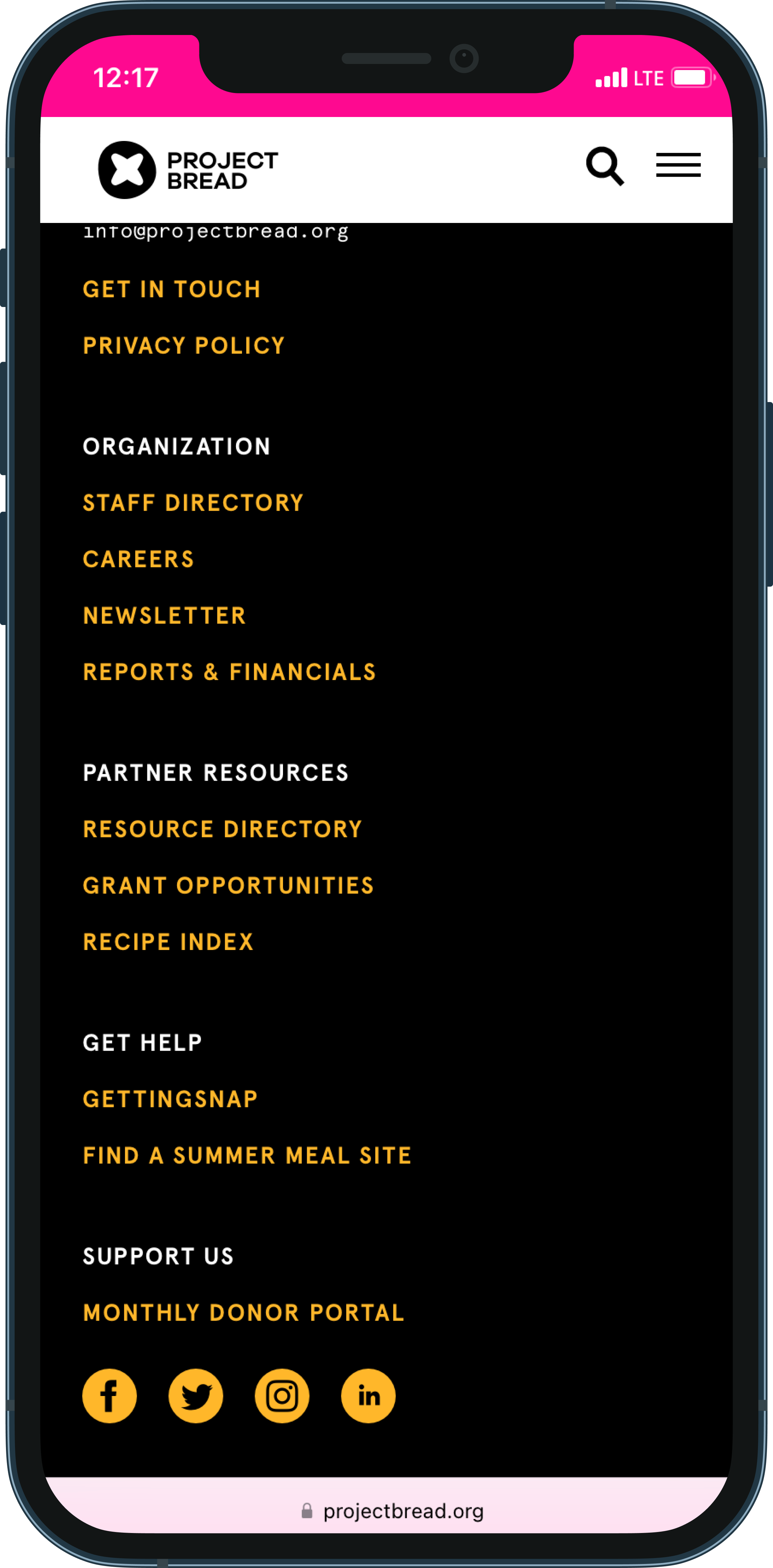
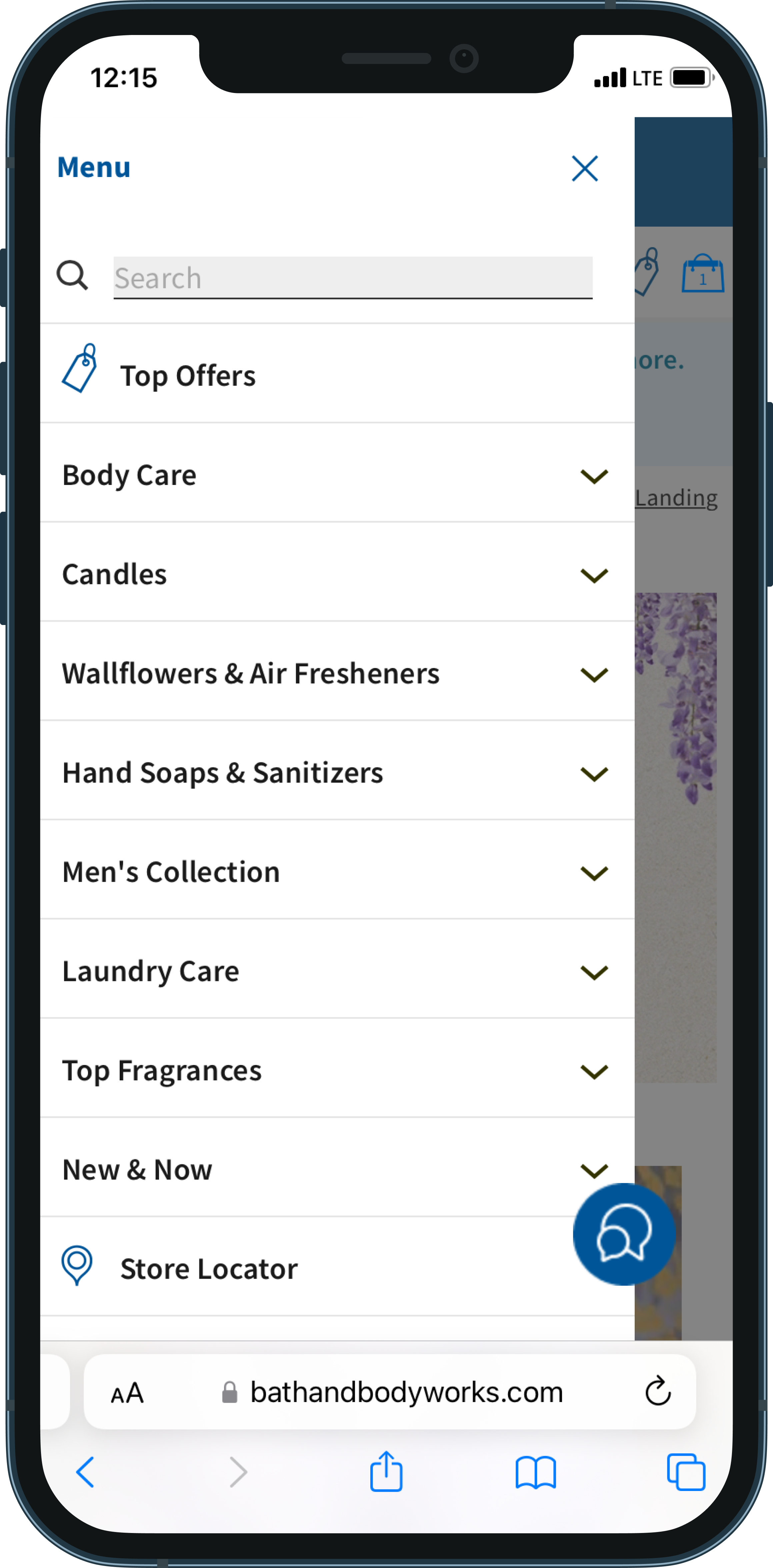
For inspiration on navigation layout, fonts, colors, footer design, social links, and overall site design, I conducted a comparative analysis of websites that feature shopping cart or donation platforms.
Two companies I explored were Project Bread and Bath & Body Works, both of which have clean layouts and navigation menus that I thought would work well for the mobile experience of Student LunchBox.
Themes That Emerged…
User Interviews, Usability Testing, and Survey Results
A deeper understanding was needed of what donations looked like in terms of food, resources, and programs. In particular, users wanted clarity on how the organization ensured that 100% of donations went to the local community. Users questioned what Student LunchBox did for students when events were not occurring and why it was easy to find ways to donate but not clear where students seeking food could find information. There were questions why there were three areas in navigation for donating; site visitors had trouble understanding where their money went. One donation area in particular utilized Cryptocurrency and stock donations which did not read as trustworthy. Clearer details were needed about the type of volunteer work, the duration of time, and any necessary information before registration. Color pairings and font sizes throughout the site made copy difficult to read at times.
What was discovered and how it was addressed
-
Donation Allocation
Proof of Donations
Quality Assurance
-
Donation Platforms
Food Distribution
Pathways for Students
-
Accomplishments
Accessibility
Consistency and Reliability
Personas…
Although the primary target audience was individuals aged 35 and older, I also considered organic traffic, which indicated that the age range of donors could be broader. I developed three detailed personas representing the diverse range of users who consistently visited the Student LunchBox website.

College Student Seeking Aid - 18-24
Needs quick and easy access to nutritious food
Finds it essential to have supportive and reliable source to access weekly
Expects consistent events or local pantries to find essentials

Donator - Student/Professional - 18-60
Needs to have transparency involving donations
Wants to see statistics and data from Student LunchBox
Expects clarity from the organization to understand the ways that they can help
Volunteer - Student/Professional - 18-26
Needs to know physical requirements
Finds it essential to feel prepared ahead of time for volunteering events
Expects to know event details such as date, location, type of clothing to wear, and duration
Information Architecture…
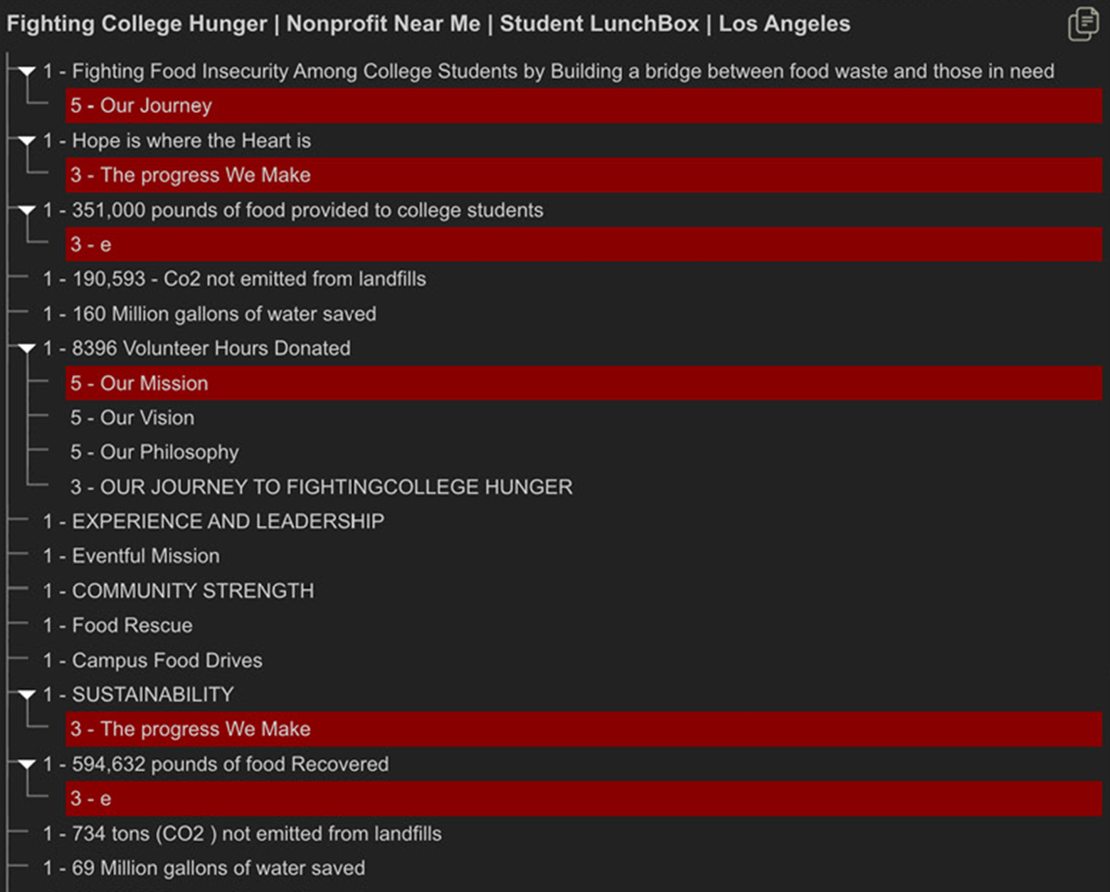
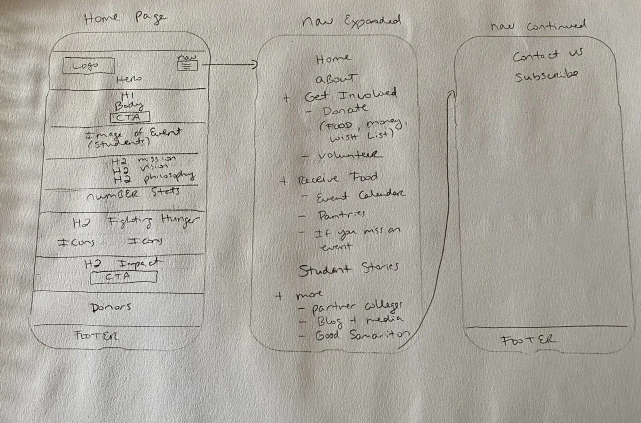
The heading structure did not adhere to accessibility standards. Screen readers were not effectively guiding users to content in a logically organized manner. To identify areas for improvement, I used a plugin called HeadingsMap. Additionally, I examined the site map to explore alternative content organization strategies, incorporating feedback from usability testing and considering the needs of the target personas. Based on this analysis, I developed a revised information architecture and created initial sketches. These sketches served as a visual guide for testing new layouts.
Sketches…
I began by creating initial sketches with pencil and paper, revisiting and refining them throughout the project. During reviews, I presented my designs along with the rationale behind my decisions. By incorporating feedback, I was able to enhance content organization and design functionality, resulting in a more streamlined and effective user flow.
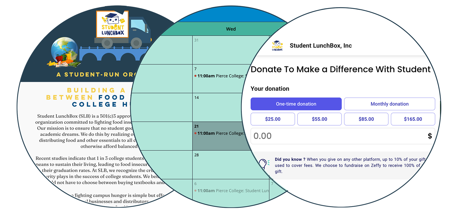
Donation Concerns…
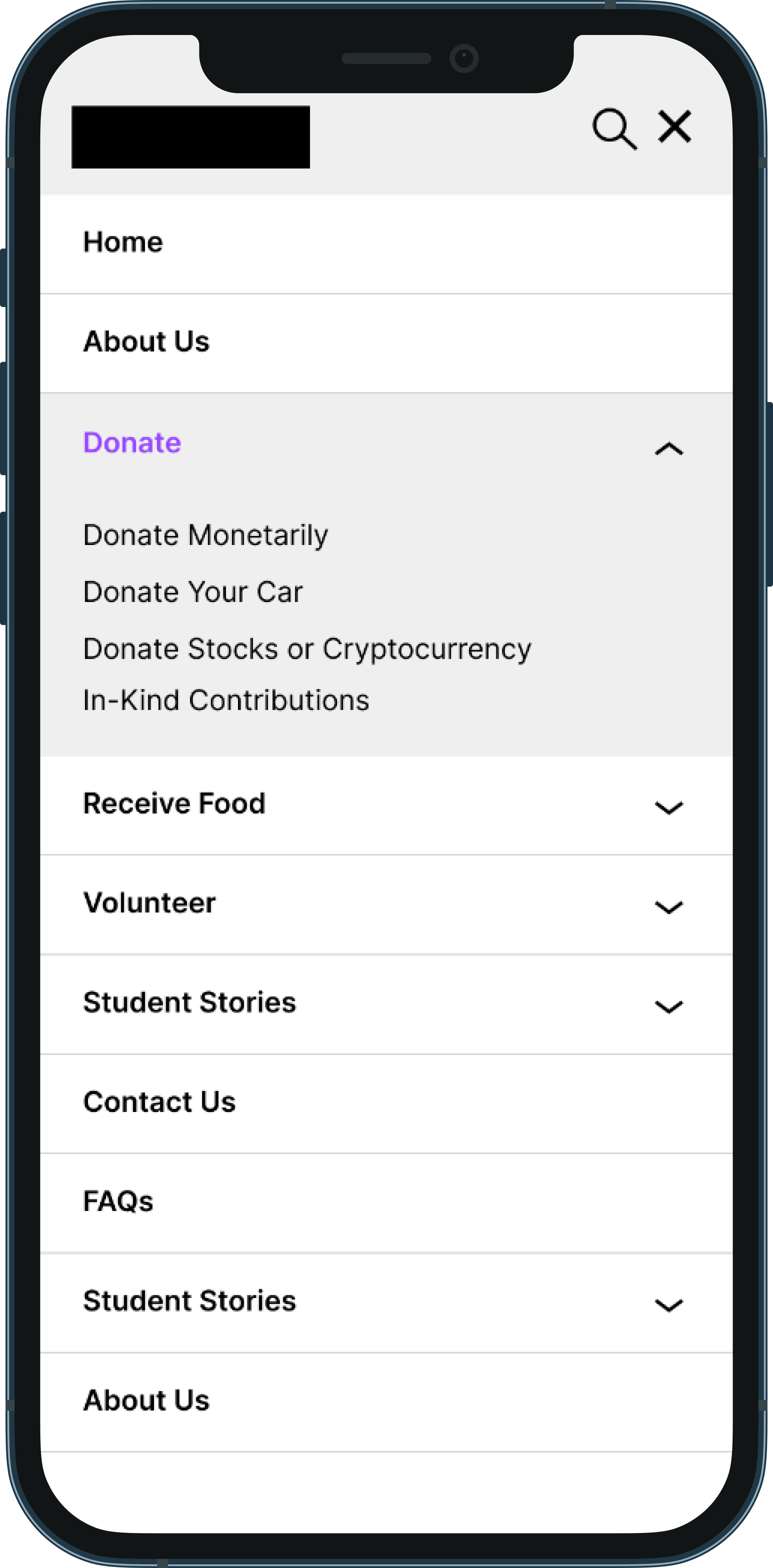
The donation process on the Student LunchBox website posed several challenges for users. With five different donation options in the navigation and a donate button on the homepage, the purpose of each option was unclear. Through desktop research and competitive analysis, I developed solutions that optimized the existing platforms and addressed issues related to navigation and user trust.

How I addressed the areas of concern
-
Users experienced a loss of trust when redirected to an external site for monetary donations, which did not include a return link to Student LunchBox.
The limited payment options, restricted to bank information and specific credit cards, further discouraged users.
Additionally, the absence of a physical mailing address and contact information, coupled with no option to mail in a check, raised concerns about the platform’s legitimacy, particularly among older generations. This contributed to users abandoning the donation process.
To address the issue of location and mailing address, I redesigned the footer to include this information, as well as a contact number and email address.
I also embedded the donation form directly on the Student LunchBox site and added instructions for mailing a check, including the mailing address, to ensure a seamless donation experience.
-
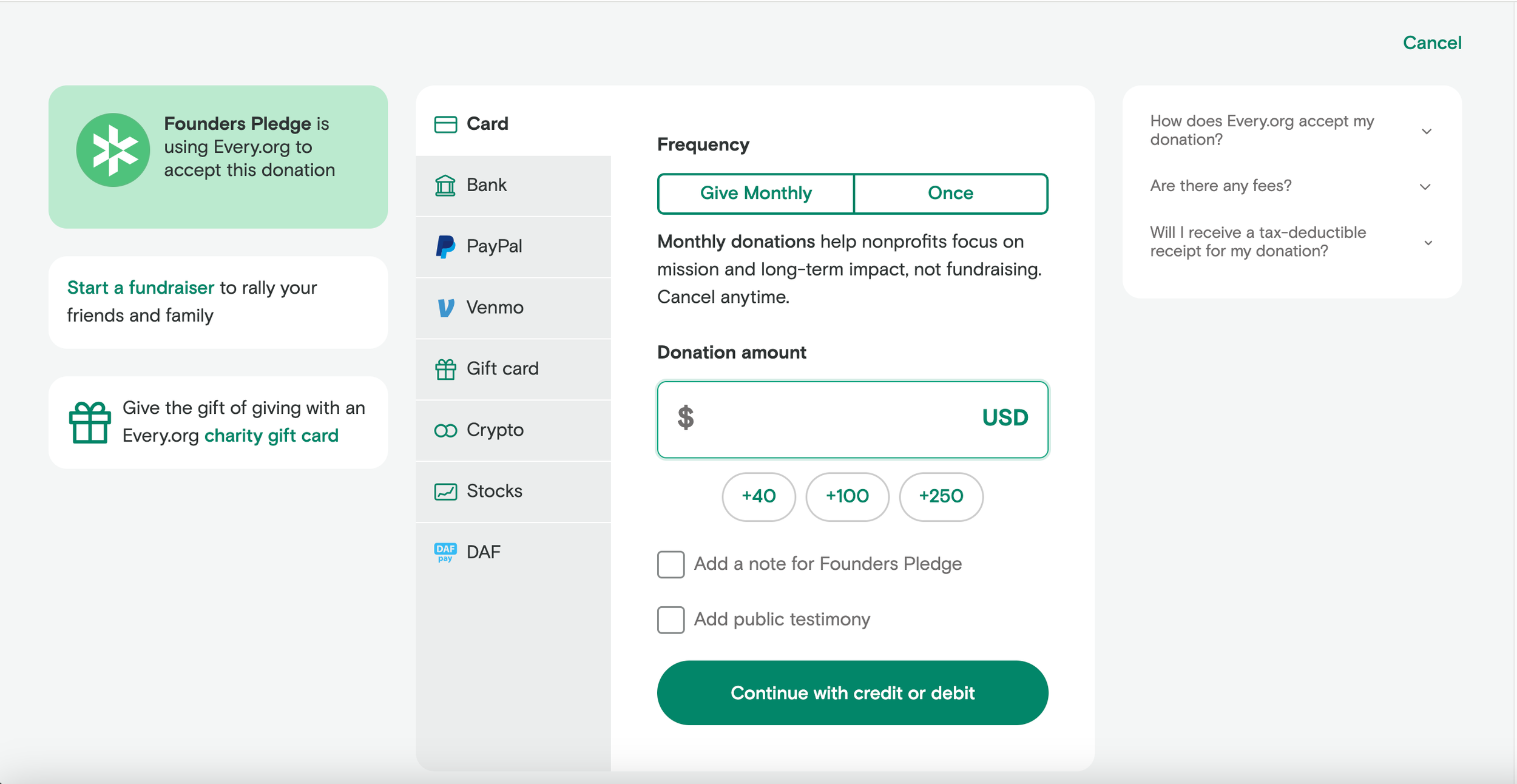
In the "Other Ways to Donate" section, there was only a brief mention of cryptocurrency and stocks as donation options, without clear details on how these methods worked. Visitors were directed to an external platform sponsored by Every.org, which could create confusion.
To address this, I conducted research on other companies using this platform to verify its legitimacy. By comparing it with Founders Pledge, I identified effective strategies for integrating it. I then redesigned the donation page on the Student LunchBox site and created a mockup demonstrating how to incorporate additional payment options into their Every.org page.
-
Student LunchBox users utilize Zeffy.com as their platform for monetary donations. I discovered that they were not fully leveraging available features, such as embedding donation forms directly on their website instead of redirecting users to an external site.
Additionally, they had not set up more secure payment options like PayPal, Venmo, or alternative credit options beyond what was currently offered. The site also lacked an option for mailing in checks and did not provide contact information for further inquiries.
-
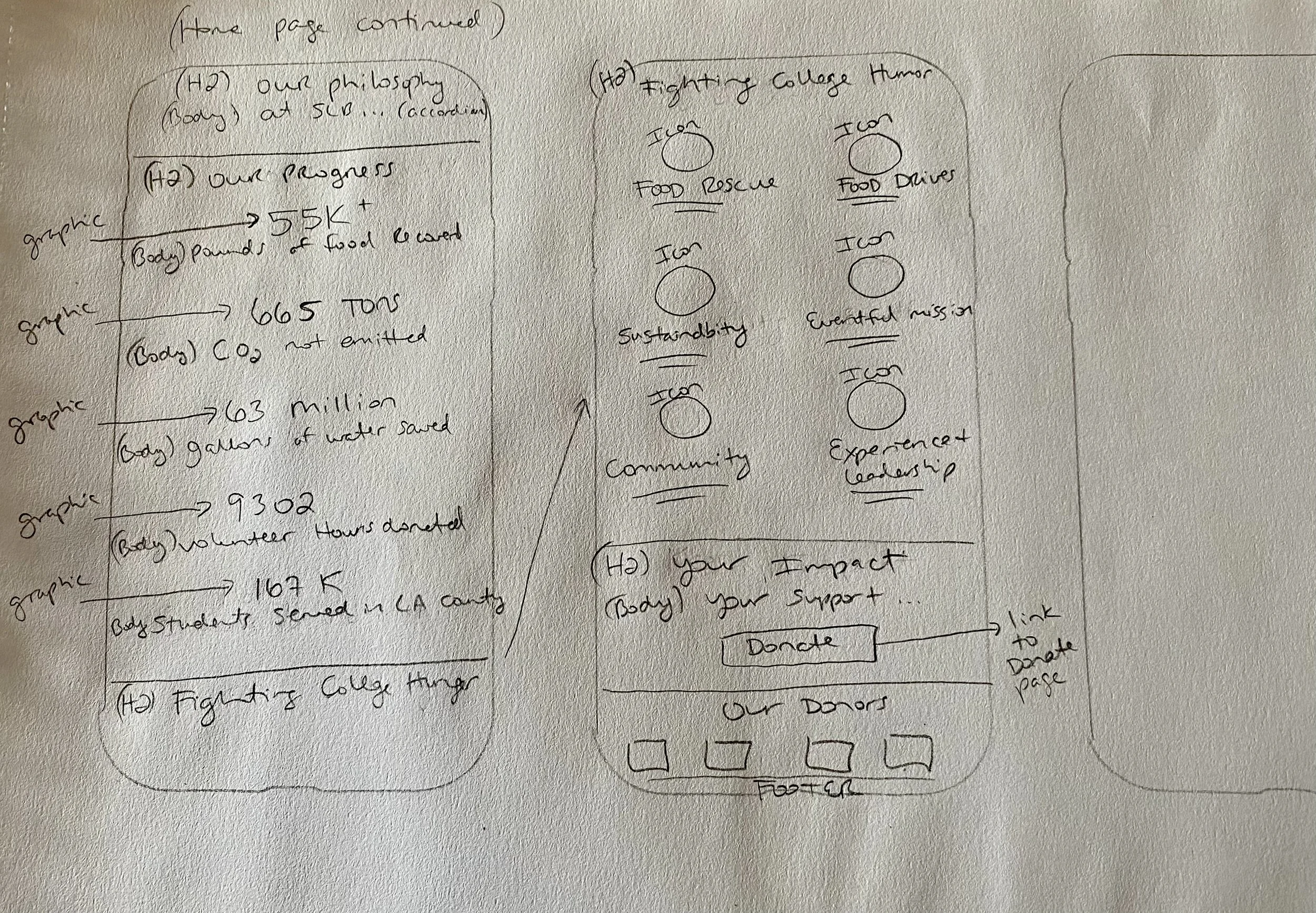
The Wish List section aimed to highlight the organization's operational needs and the resources required to support students facing food insecurity.
While the concept was strong, it lacked clear calls to action and sufficient information for users to understand the needs and how they could contribute. I redesigned the page to address these issues, enhancing clarity around donation types and providing actionable steps for support.
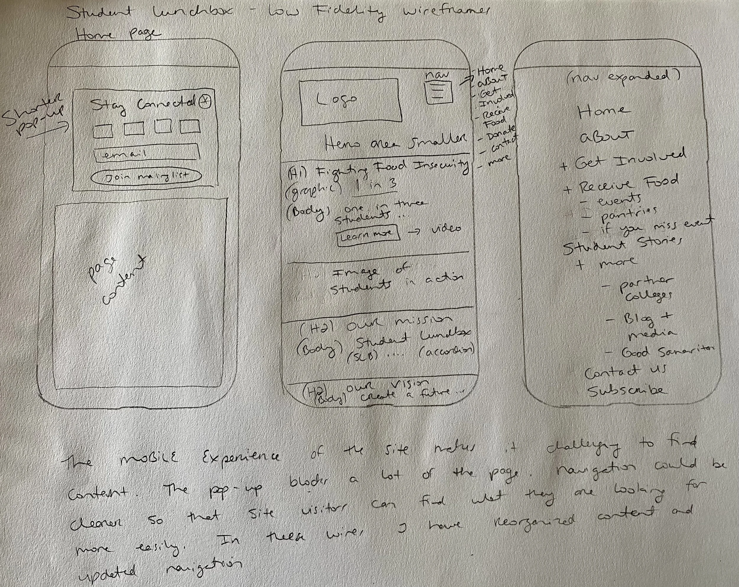
Low-Fidelity Wireframes…
While developing and refining the designs into low-fidelity wireframes, I also assumed the role of copywriter. My objective was to enhance user clarity based on feedback from usability testing. I streamlined paragraphs to ensure conciseness and designed icons to facilitate easier information absorption. Additionally, I crafted precise calls to action for each link, clearly indicating their purpose and the subsequent navigation after clicking. I also provided guidance on colors for the site to improve accessibility.


What I updated and how
-
For much of the site, I utilized existing imagery, selecting the highest resolution images that complemented the copy effectively.
I designed hero images that aligned with the new navigation and worked seamlessly with the headlines and descriptive text I had crafted.
In some cases, I chose to split long pages into two to reduce excessive scrolling and enhance the user experience. On the revised pages, I incorporated a mix of existing photography and newly sourced or created imagery, ensuring a cohesive and engaging visual presentation.
-
Drawing inspiration from sites reviewed during the comparative analysis, I redesigned the dropdown menu to improve site content organization and enhance the mobile experience.
This revision was especially important for students seeking timely assistance, allowing them to more easily and quickly access events and resources.
Additionally, I streamlined the content for volunteers by providing more detailed information about events, including a clearer calendar.
I crested a page for Volunteer FAQs in which I specified the types of activities involved, such as physical labor, time commitments, and clothing or shoe requirements.
-
The organization lacked a formal style guide, although the logo colors were clearly defined. However, certain color combinations, such as yellow text on a white background, proved difficult to read.
Additionally, call-to-action colors blended into the surrounding color blocks, diminishing their visibility. The presence of multiple colors on each page further complicated the identification of the brand's color scheme.
The design also suffered from a lack of white space between sections, resulting in unclear boundaries and making it difficult to distinguish where one section ended and another began.
-
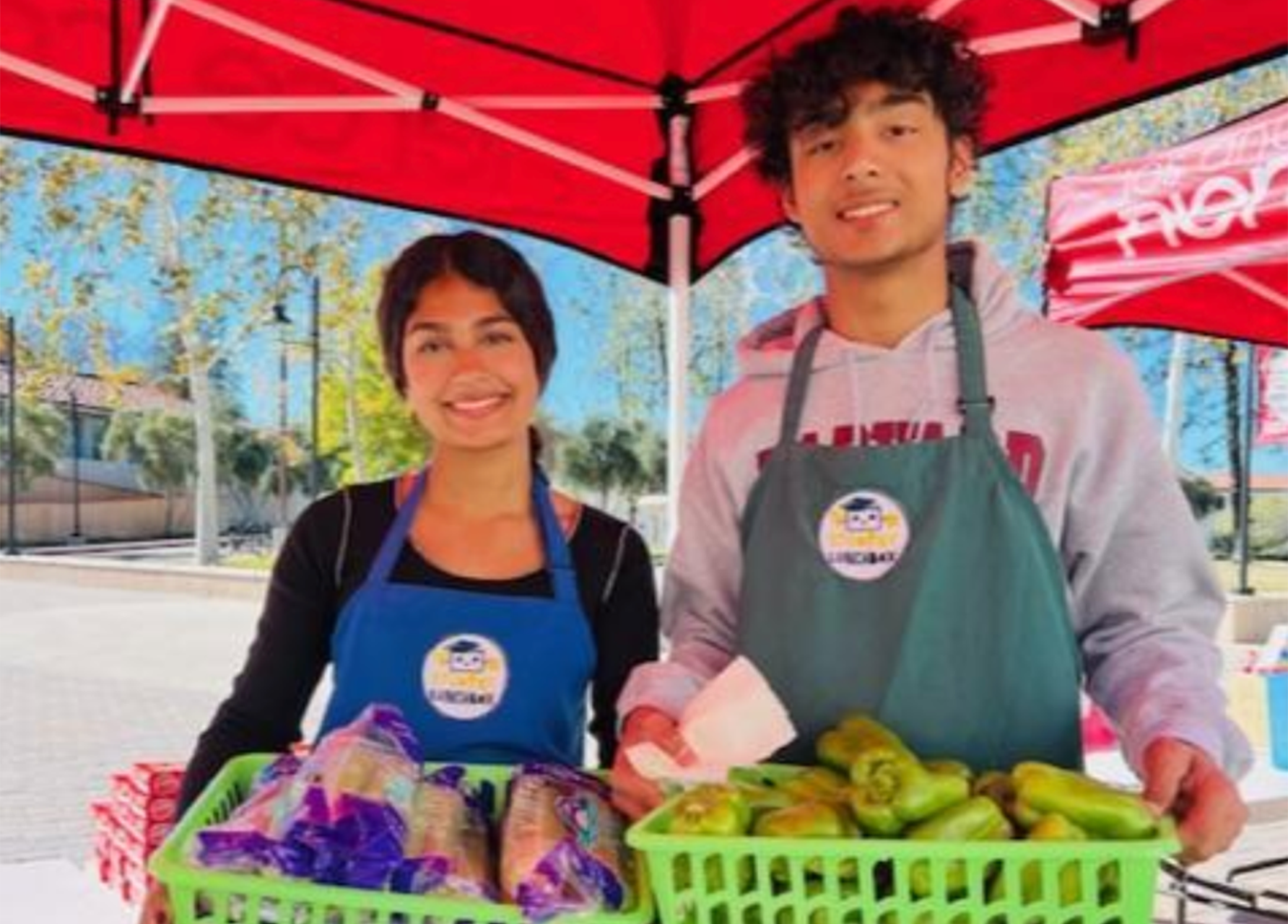
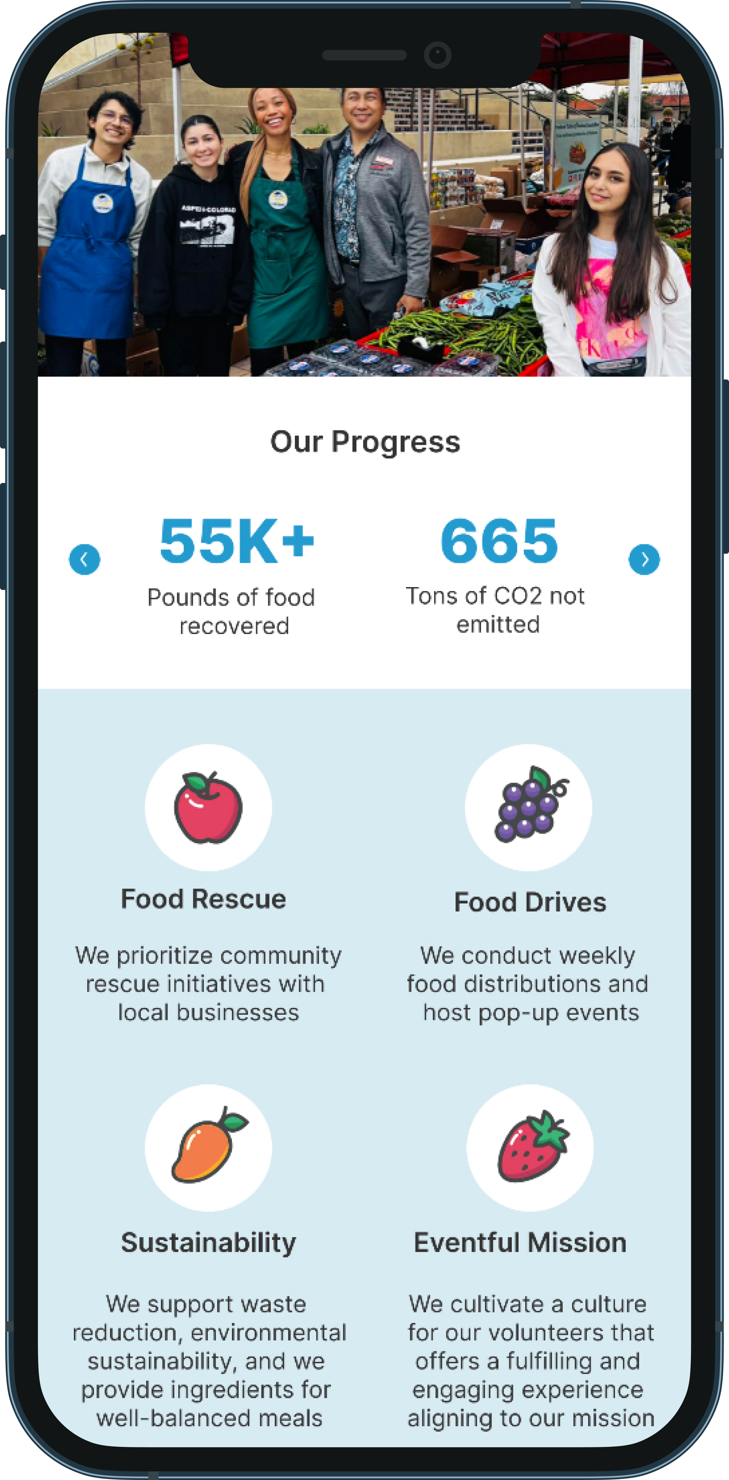
Icons and statistics can often convey information more effectively than lengthy paragraphs of text. Based on user feedback emphasizing the need for quick and easy access to content, I developed callouts and iconography.
The icons, representing food items, aligned with the organization’s core mission to address food insecurity.
The objective was to create an experience where content is easily understood, clearly communicating the organization’s activities, the frequency of their events, and their environmental support initiatives.
High-Fidelity Wireframes…
After ensuring that the content was logically organized and that I addressed issues related to trust, navigation, donation platforms, and volunteering, I advanced the design to high-fidelity wireframes. Once I tested the interactivity and confirmed that the heading structure was effective, I was prepared to present the findings to Karlen so that Student LunchBox could incorporate design suggestions.


The tools I used and design decisions I made
-
Wirefames were created in Figma, utilizing the prototyping feature to incorporate interactivity. This approach provided valuable insights into how the website would function on mobile platforms and allowed me to identify any issues or gaps in the design. It also enabled me to make necessary adjustments before presenting the final design to stakeholders.
-
My preferred tool for assessing color accessibility for normal text, large text, and graphical elements is the WebAIM Contrast Checker. I utilized this tool extensively throughout the design process, especially during the development of high-fidelity wireframes.
The WebAIM Contrast Checker helps web developers, designers, and content creators evaluate color contrast between text and its background to ensure it meets accessibility standards.
Proper color contrast is essential for readability and accessibility, particularly for individuals with visual impairments such as color blindness or low vision.
The tool ensures that contrast ratios comply with the Web Content Accessibility Guidelines (WCAG) for various levels of text visibility. It adheres to WCAG 2.0 and WCAG 2.1 standards, which specify required contrast ratios for different accessibility levels (AA and AAA). For instance, WCAG 2.0 mandates a contrast ratio of at least 4.5:1 for normal text and 3:1 for large text to achieve the AA level of accessibility.
-
The website featured valuable information and testimonials, but it was challenging to navigate.
To improve this, I created a dedicated section in the navigation that consolidates student stories, media, the Student LunchBox blog, and testimonials. By centralizing these elements into a single hub, users can now more easily access and find relevant content.