ReWorld
User Experience & Mobile Design
June-August 2024
ReWorld, is dedicated to the preservation of rainforests, beginning with the endangered tropical forest in Colombia. In collaboration with Proyecto Titi, a respected Colombian Conservation nonprofit, ReWorld directs donations toward acquiring and conserving threatened lands. The task …
Meet accessibility standards seamlessly, ensuring an intuitive and user-friendly interface for everyone.
Redefine the mobile user experience utilizing responsive design
Enhance site navigation and information architecture to ensure that content is organized in a more logical and intuitive manner.
Address and resolve user trust issues by establishing credibility and clearly defining carbon credits and greenwashing.
Objectives…
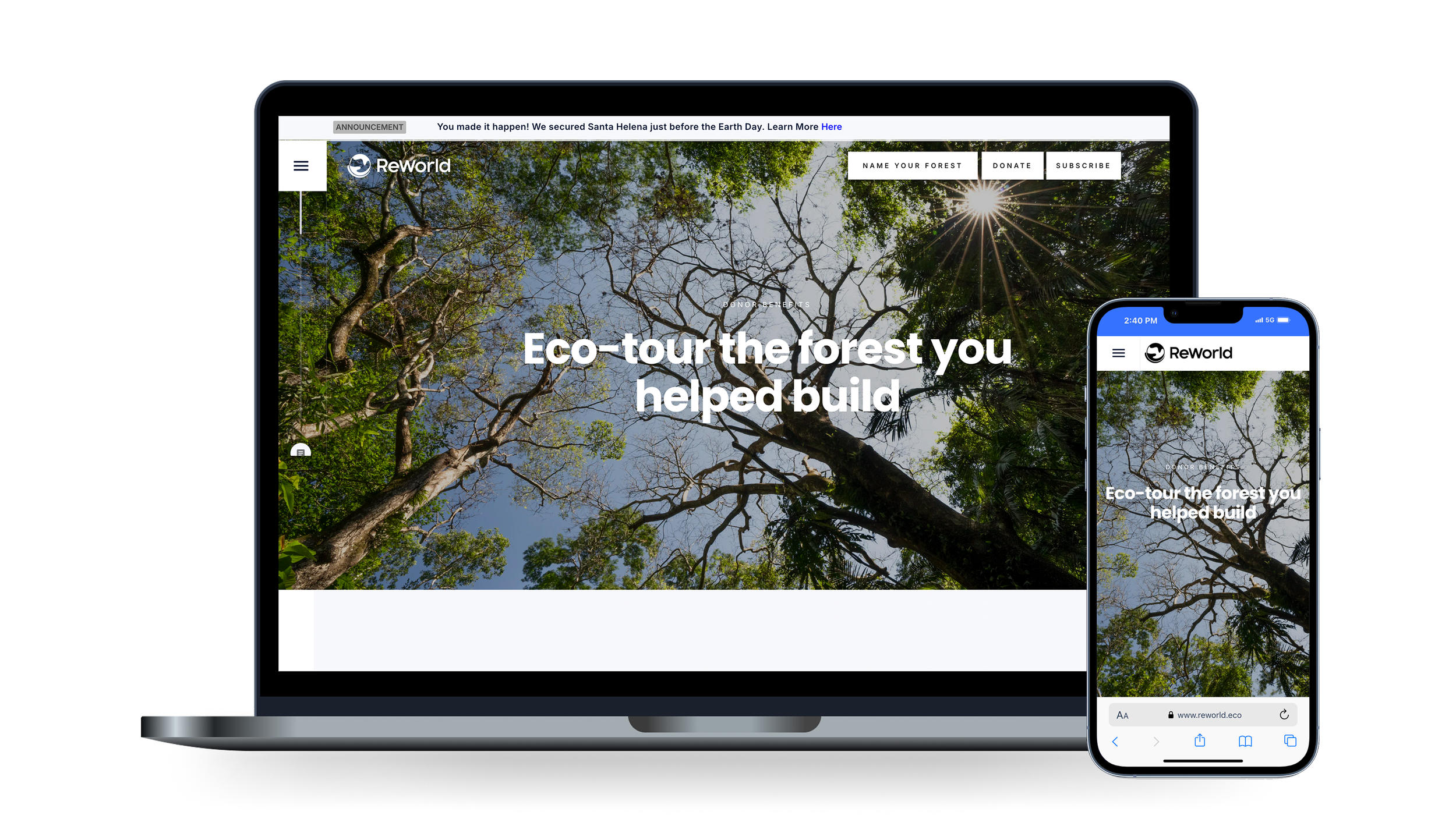
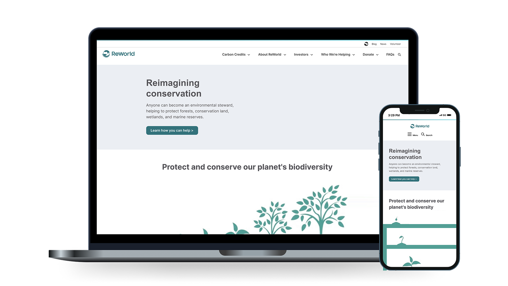
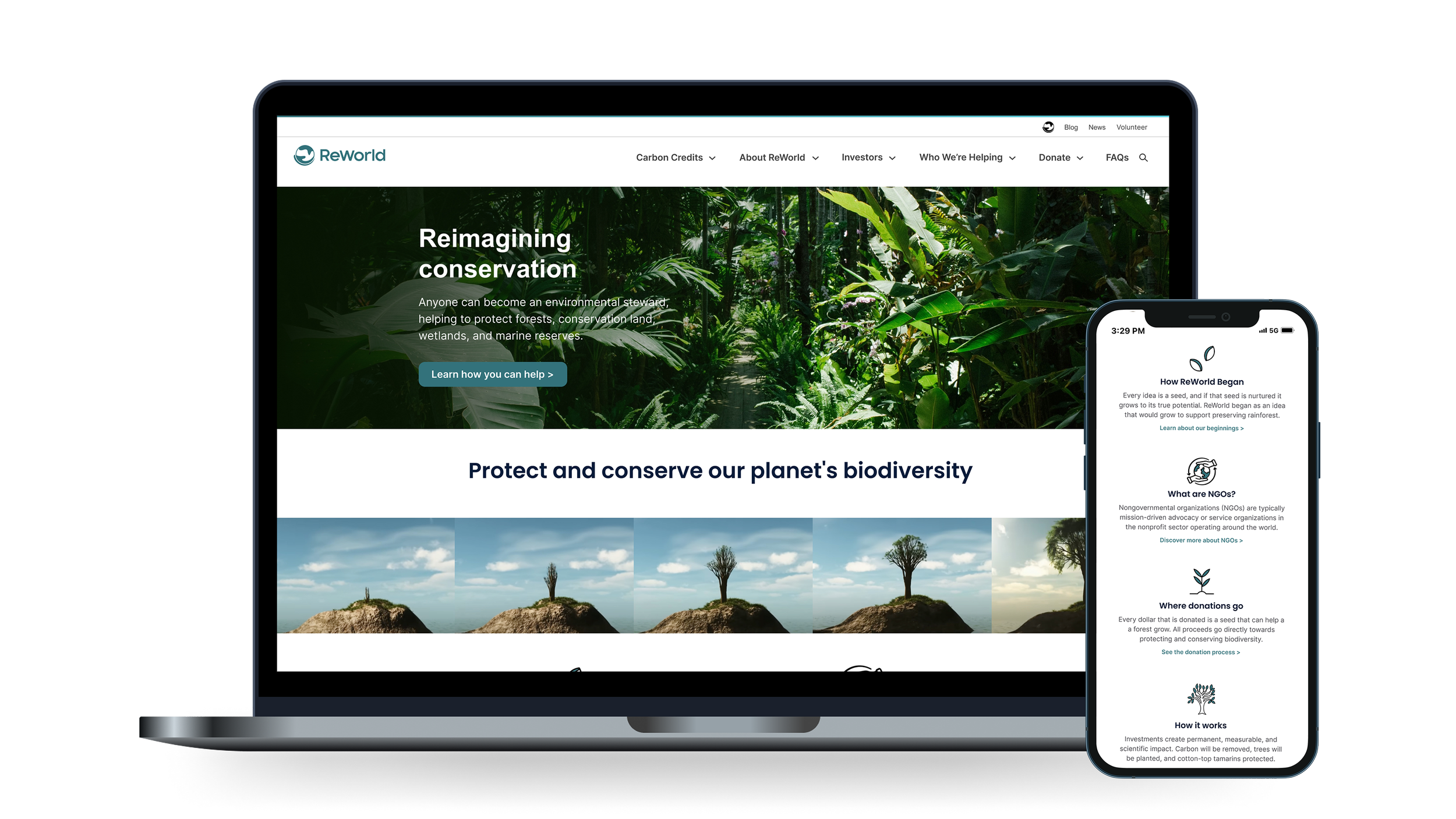
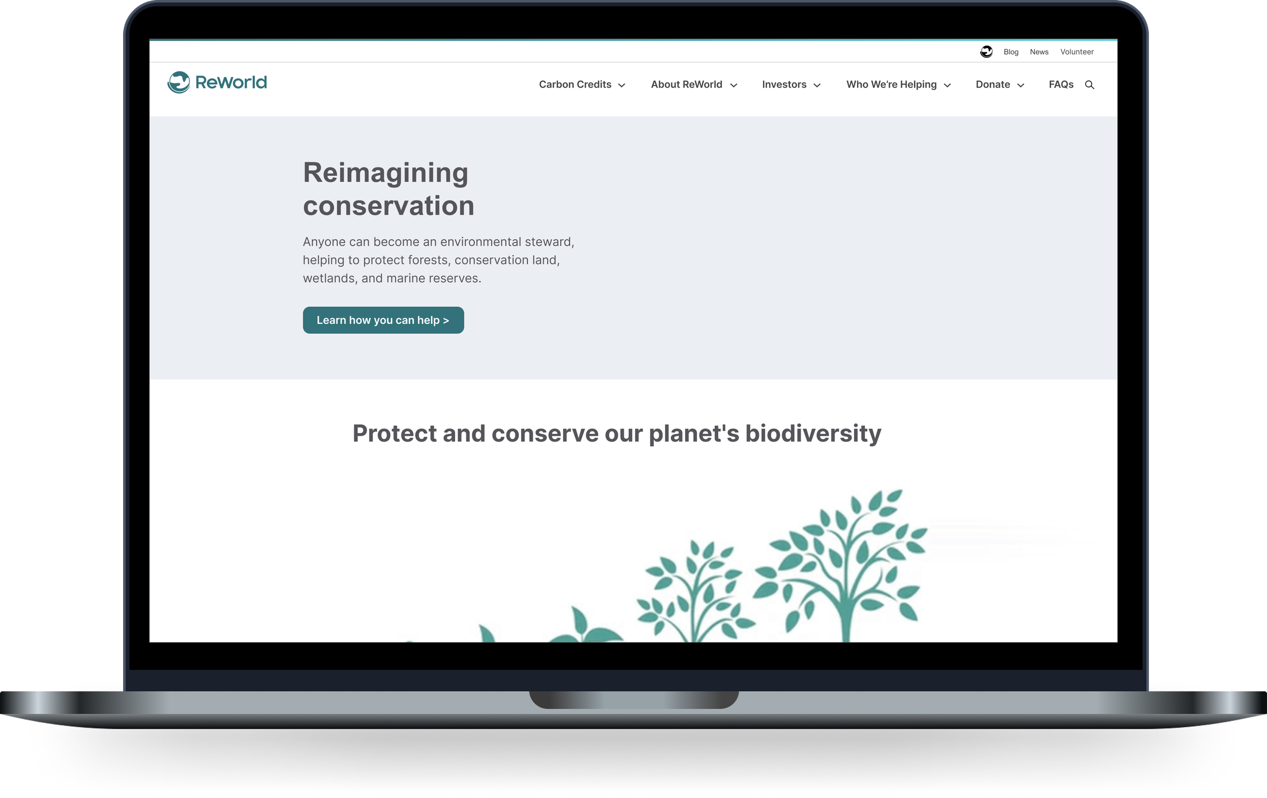
The main focus is to redesign the homepage to clearly convey ReWorld’s new carbon offset message and illustrate how it provides a pathway for companies to reduce their carbon footprint.
The website should also serve as a resource for donors who supported the initial phase of the project—land acquisition—by offering transparent insights into how their contributions have been utilized and the impact they’ve made. This includes showcasing the project's progress, such as tree planting and care, carbon credit issuance, and area security.

The methods I used and data that was collected
-
Empathize:
Stakeholder Interviews
Desktop Research
Competitor Analysis
Define:
Personas
Problem Statement
User Journey Maps
Ideate:
Sketching
How Might We Statements
Rapid Ideation
Prototype:
Low-Fidelity Wireframes
High-Fidelity Wireframes
Test:
Validate ideas
Refine Designs
Iteratively Build
-
Key points from user research:
Site navigation: Users find it challenging to easily learn more about the site. Locating specific information is difficult due to issues with the navigation bar and site map.
"About Me" sections for animals and trees: Offer more engaging details about the species inhabiting this region and present information from their perspectives. For example, narrate the journey of a tree growing from a seed.
Address technical issues, formatting, and content organization to ensure that critical information is easy to locate and understand.
-
Visitors to the ReWorld website struggled to quickly and easily locate the content they sought. The top navigation bar is concealed until the user scrolls past the hero image, which is both tall and occupies most of the screen above the fold.
Multiple call-to-action buttons are scattered across the homepage and subpages, but a significant amount of information appears to be buried within the site. A comprehensive reorganization of the information architecture is essential.
Additionally, the mobile experience is particularly problematic, as the content is primarily designed for desktop and does not translate well to mobile devices.
-
Clearly define ambiguous or confusing terms that may discourage potential donors from contributing to ReWorld. Providing precise explanations and simplifying complex concepts will help build trust and facilitate informed decision-making among prospective supporters.
Thoroughly address the concerns identified in user research by implementing targeted solutions that directly respond to user feedback. This involves prioritizing the most critical issues, refining user interactions, and ensuring that changes effectively resolve the problems reported. By systematically addressing these concerns, we can enhance user satisfaction and engagement.
Develop and implement solutions that not only address the organization's needs but also elevate the design to a level that is both visually appealing and easy to understand. This includes creating aesthetically pleasing designs that enhance user experience while ensuring that the content is clear, intuitive, and effectively communicates the intended message. By balancing functionality with visual appeal, we can create a more engaging and user-friendly interface.
The approach…
I reviewed the brief provided by ReWorld, and the user research that had been done in order to understand the pain points, challenges, and opportunities for improvement identified in the findings. I then spent time exploring the site from the perspective of someone wanting to learn more about the organization and pinpointing the areas flagged as problematic in the user research. I had difficulty locating specific items and found the absence of a search bar to be a significant issue.
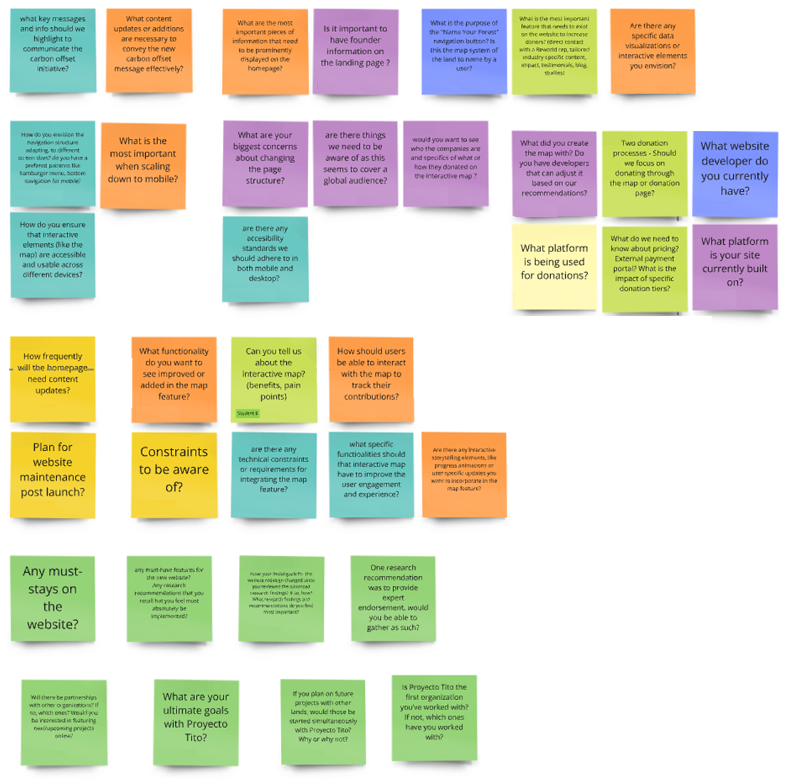
Drawing from this information I developed stakeholder questions using affinity mapping on a Miro board with sticky notes. This process revealed common themes, including: Marketing, Key Performance Indicators (KPIs), Pain Points, User Research Findings, Donors, Key Information/Features on the Current Website, Data/Analytics, Competitors, and Design-related issues.
Stakeholder Interview…
Using the themes from the affinity map, I developed a set of questions for a stakeholder interview with Prudhvi Dharmana, Founder of ReWorld, based in the Bay Area, CA. During the interview, we explored the topic of carbon footprint, which the brief identified as a key aspect of their mission but had not been fully detailed. Prudhvi provided valuable insights into carbon credits, explaining them as a mechanism for funding climate action by reducing greenhouse gas emissions.
He also highlighted the issue of greenwashing and potential scams that could undermine the organization’s credibility. This is particularly relevant as potential donors may be hesitant about contributing if they are unsure whether their donations are genuinely supporting climate efforts and reducing carbon footprints.
Addressing these challenges was essential for establishing ReWorld as a trustworthy and credible organization. This will enable visitors to confidently make donations and share positive feedback about their experience with others.
Themes discovered from the stakeholder interview
-
ReWorld, a non-profit organization, aimed to provide visitors with complete transparency regarding their identity and mission. While the website includes information about volunteers and essential details, it does not fully elaborate on these aspects. ReWorld wants to clearly communicate their status as a non-profit and emphasize that 100% of donations are directed to their initiatives.
The organization also highlights its partnership with Proyecto Tití, another non-profit. Proyecto Tití runs a comprehensive on-site conservation program in Colombia, integrating field research, educational initiatives, and community programs to make the conservation of natural resources economically viable for local communities.
The program aims to offer valuable information for the long-term preservation of the cotton-top tamarin and to cultivate local advocates who will support and promote conservation efforts in Colombia.
-
Visitors to the ReWorld website had difficulty quickly and easily finding the content they needed. The top navigation bar remains hidden until the user scrolls past the tall hero image, which dominates the screen above the fold.
Call-to-action buttons are scattered across the homepage and subpages, but much of the information seems buried within the site. A thorough reorganization of the information architecture is necessary to address this issue.
Moreover, the mobile experience is particularly problematic, as the content is designed primarily for desktop and does not translate well to mobile devices.
-
A carbon credit represents a reduction of one metric ton of greenhouse gas emissions. A buyer pays a company to reduce emissions, and the buyer receives a credit for the reduction.
Projects that reduce or remove greenhouse gas emissions generate carbon credits. These projects are independently audited to verify the emissions reduction.
Carbon credits can be bought, sold, or traded before they are "retired" and can no longer be traded. Carbon credits support projects that reduce emissions, protect ecosystems, and install efficient technology
-
Greenwashing is the practice of companies or organizations misleading consumers about the environmental benefits of their products, services, or practices.
It involves making exaggerated or false claims about the environmental sustainability or eco-friendliness of their offerings in order to appear more environmentally responsible than they actually are.
Greenwashing can include using vague or deceptive language, highlighting a minor environmental initiative while ignoring significant environmental harm, or using misleading labels and certifications. The goal of greenwashing is to attract environmentally conscious consumers and improve the company's public image without making substantial, genuine efforts to reduce its environmental impact.
ReWorld Founders:
Chris Vargas, Prudhvi Dharmana, Christie Burley
Research Methods…
At the conclusion of the stakeholder interview, I created a new affinity map to identify themes expanded upon with the additional insights provided by Prudhvi. Using Miro’s Cluster tool, I aligned related items and used this information to delve deeper into the issues affecting both the ReWorld organization and its site visitors. This process was crucial for refining my research and developing targeted interview questions for candidates who met the criteria for the target audience, as defined in the brief for usability testing.

Research methodologies I used
-
In my approach to usability testing for ReWorld, I evaluated how effectively and efficiently users interacted with the existing website, as well as the low and high-fidelity wireframes I had designed.
During these tests, I observed members of the target audience as they performed specific tasks and collected data on their performance, behavior, and feedback.
My primary goals for usability testing were to:
Identify Problems: Discover usability issues and obstacles that users faced.
Evaluate Effectiveness: Assess how well the website met user needs and expectations.
Gather Feedback: Obtain direct user opinions on the product’s design, functionality, and overall experience.
Improve Design: Use the insights gained to make iterative improvements and enhancements to the product.
My goal from the testing was to ensure that the website was user-friendly, intuitive, and accessible, which ultimately led to a better user experience and increased satisfaction.
-
I gathered information and insights from existing data and sources to make informed decisions about my designs.
Some of these included white papers and articles, for example:National Library of Medicine:
Understanding the Use of Carbon Credits by Companies: A Review of the Defining Elements of Corporate Climate ClaimsHarvard Business Review:
What Every Leader Needs to Know About Carbon Credits
MIT News:
-
I researched competitors to gain insights into their products and marketing strategies, aiming to identify gaps in ReWorld's approach.
By comparing what other organizations excelled at, I was able to pinpoint both their strengths and weaknesses. This analysis enabled me to integrate these findings into my design, building upon existing practices to enhance ReWorld's strategy.
Among the companies I examined were Rainforest Action Network and Save the Rainforest Now. Both organizations claim a commitment to rainforest conservation, accept donations, and make statements about reducing carbon footprints.
-
To gather inspiration for navigation layout, fonts, colors, footer design, social links, and overall site design, I analyzed websites featuring shopping carts and donation platforms.
I focused on Disney and Cadbury, both of which utilize expansive navigation menus, include search functionality, and offer extensive content.
Usability Testing…
I conducted usability testing with participants who met the criteria for the target audience to understand their actions, experiences, and to assess the intuitiveness of the UX design. The results of the usability testing allowed me to analyze the data, identify key themes, and pinpoint areas for improvement.
The testing was carried out in three phases:
Existing Site: testing with a group using the current ReWorld website.
Low-Fidelity Prototype: testing with a second group using a low-fidelity prototype I created.
High-Fidelity Wireframes: Testing with a third group using high-fidelity wireframes to evaluate if the identified issues were resolved and whether the overall user experience had improved.
Target Audience:
Location: Primarily the United States.
Age: 30 and above.
Audience Type: General public; ideally, those familiar with the carbon offset system, though this is not mandatory.
Values: Environmentally conscious individuals who are committed to making a meaningful contribution to the planet.
Personas…
These personas were developed from user testing to represent the various types of visitors engaging with the ReWorld website. They provide a detailed overview of the distinct user profiles and their interactions with the site.

Jason - Professionally Employed
Professionally employed, either part-time or full-time
Passionate about supporting and meaningful and reputable causes
Concerned about avoiding scams and ensuring the legitimacy of donations

Max - Student
A strong believer in being able to change the world for the better
Talks frequently with peers about things they see online
Is well-versed in digital platforms and conscious about where her money goes

Diane - Corporate Sustainability
Understands the importance of a company's carbon footprint
Publishes annual reports regarding sustainability and philanthropy
Communicates with stakeholders to ensure transparency in goals and achievements
Themes That Emerged…
The ReWorld website contained valuable content that was often hidden within subpages or lacked clear headers for identification. While there was a “More” category in the navigation, its contents were not immediately obvious. Users struggled to find the navigation.
Many sections of the site used acronyms without defining them initially, making it unclear what they referred to in subsequent instances. For example, "NGOs" was mentioned without defining what the acronym stood for in the first instance on the page, or explaining its relevance to ReWorld.
Certain content sections, such as team member profiles, could benefit from a carousel format to reduce page length and minimize scrolling, especially on mobile devices. Additionally, information about carbon credits, currently buried in the FAQs section, should be elevated and more prominently displayed. Its current placement made it less visible and may have contributed to concerns about the legitimacy of donations to the organization.
What was essential to address from themes
-
Fully defining what carbon credits are and explaining how they work could address areas of concern.
Additionally, providing clear information about donation types and the functionality of the monetary donation platform before redirecting users offsite would be beneficial.
Users were also concerned when Stripe automatically sent verification codes to their cell phones, even if they had not used Stripe before.
-
Many transparency issues arose from the placement of information on the website. When important details were located towards the bottom of the page, not included in the navigation, or not clearly defined, users perceived this as an intentional attempt to hide the information.
-
Users noted heightened concerns about the legitimacy of an organization when they visit a website organically, or via links from ads or social platforms, especially regarding donations.
The Stripe donation platform, which only supports credit card transactions, did not meet user expectations for additional payment options such as PayPal or Venmo. Users anticipated these alternatives as an added layer of protection against fraud.

Carbon Credits…
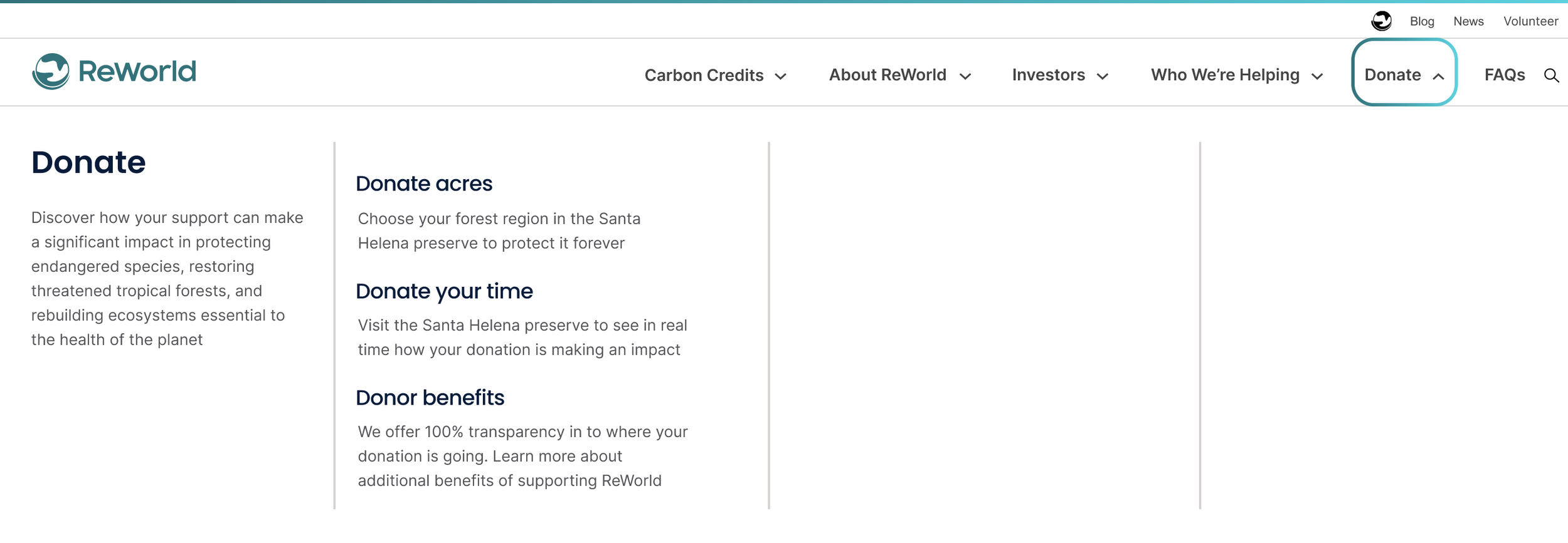
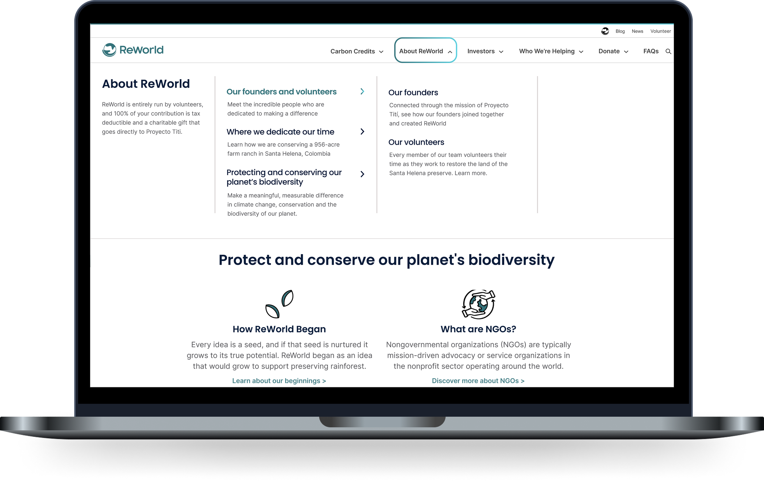
Providing a comprehensive definition of carbon credits and explaining their functionality, along with clear guidance on how to differentiate between legitimate organizations and those engaged in greenwashing or scams, could significantly address user concerns. Creating a dedicated page for this information and prominently featuring it in the navigation—rather than relegating it to a small section within the FAQs—would enhance transparency and build user trust. Additionally, elevating content for the Carbon Removal Model from a subpage into a super navigation will further enhance this section.

Donations…
The current donation call-to-action directs visitors offsite to the Stripe donation platform, which raised concerns among users. Stripe automatically sent a verification code to their phones even if they weren’t logged into the platform, and it only accepted credit card payments, lacking options for more secure methods like PayPal or Venmo. To enhance user experience, consolidating all donation-related sections—such as "Donate Acres," "Donor Benefits," and "Donation Platform"—into a unified navigation and sub-navigation structure would significantly improve accessibility and coherence.
Low-Fidelity Wireframes…
After analyzing data from stakeholder interviews, desktop research, usability testing, and competitive and comparative analysis, I created low-fidelity wireframes in Figma. These wireframes used simplified visual elements to outline the interface's structure and layout, allowing for the testing of navigation, basic framework, and functionality. I included placeholder visuals and icons to represent various components such as buttons and content areas. Additionally, I drafted the copy for headings, calls to action, and navigation labels. This process helped visualize content flow and ensure the design effectively communicates its purpose and meets user needs before advancing to high-fidelity wireframes.

Smartly utilizing visuals and organizing content
-
Visuals in this stage of design were placeholder and simple shapes, while some of the copy was lorem ipsum.
-
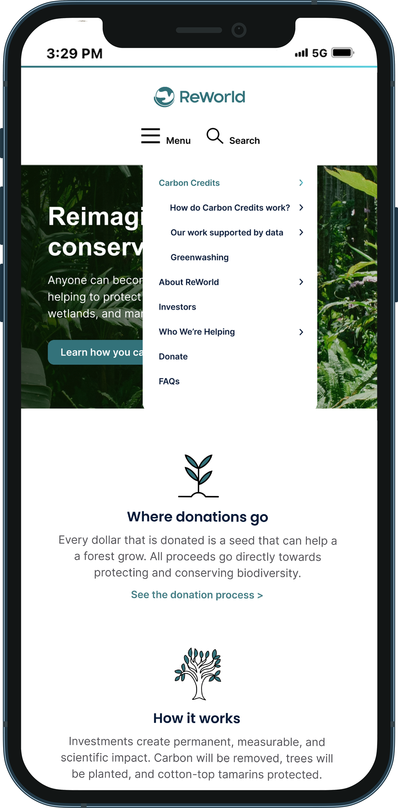
Inspired by the comparative analysis, I redesigned the dropdown menu to better organize content and enhance the mobile experience.
During this process, I recognized the need for a more robust navigation style to improve overall content organization across the site.
High-Fidelity Wireframes…
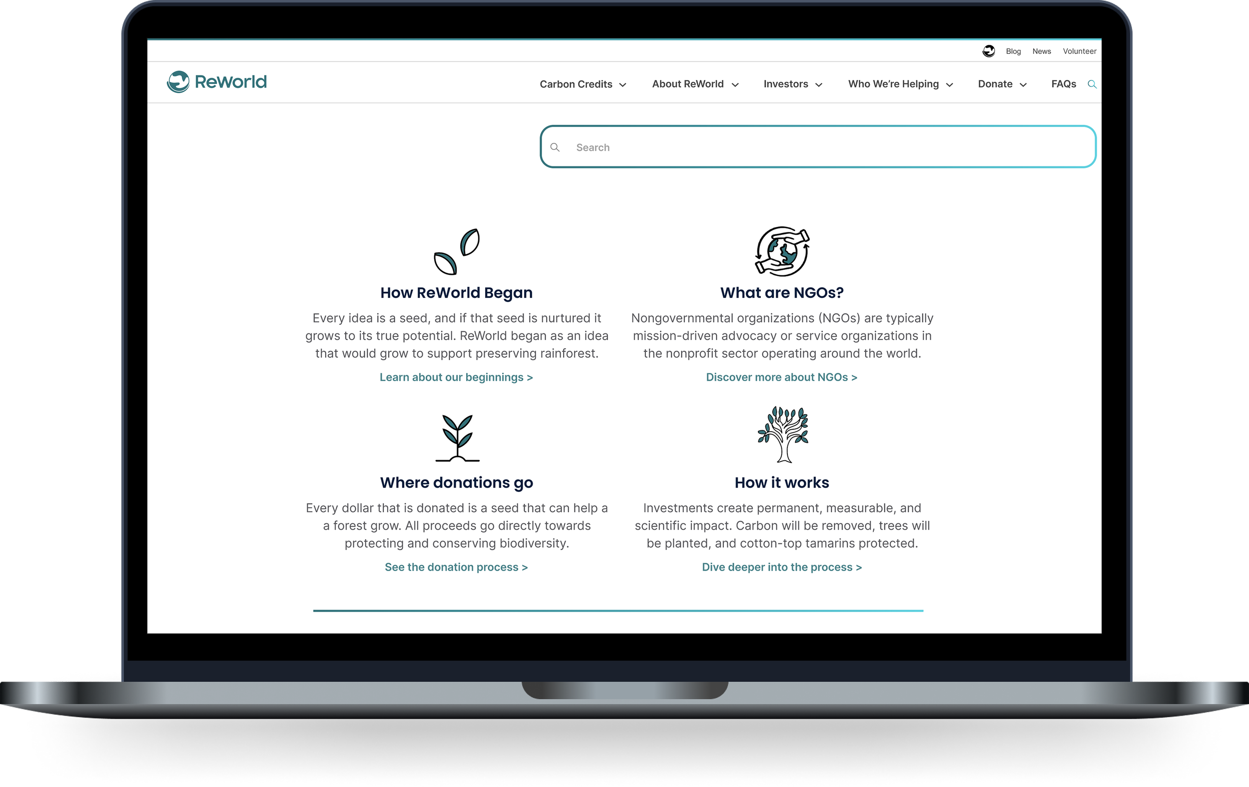
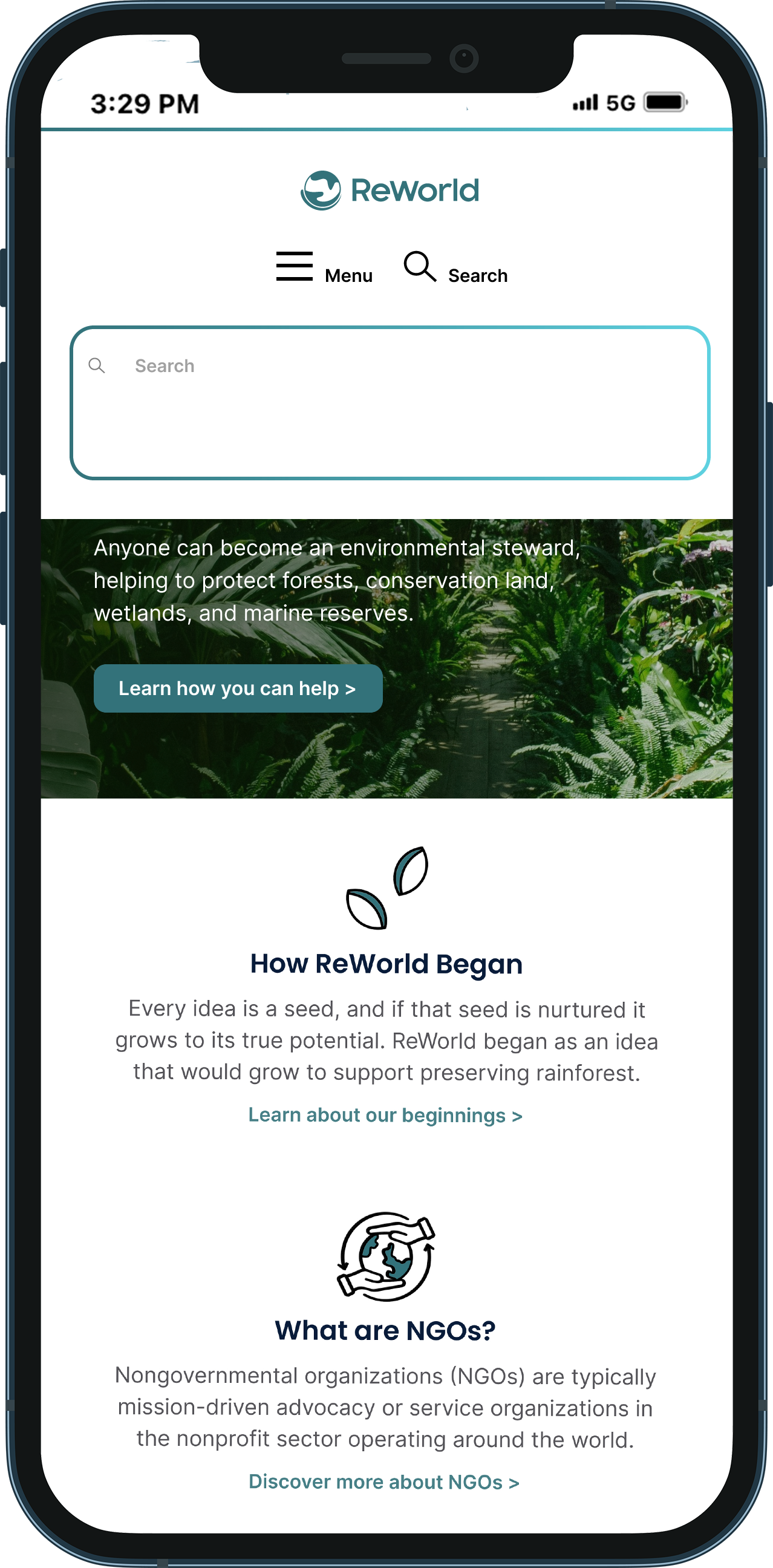
Usability testing of both low-fidelity and high-fidelity wireframes provided valuable insights into the effectiveness of the designs and areas for improvement. Feedback indicated that the expanded navigation made it easier for participants to locate information and that the search feature, commonly found on most websites, was a valuable addition. Participants appreciated the color palette, noted the cleaner spacing, and found the copy more readable due to its clear, concise language. Adding an "Investors" section to the navigation enhanced the site’s credibility by providing access to annual reports and statistics. Additionally, including definitions of categories in the navigation and expanding information on Carbon Credits was deemed necessary.
Meeting accessibility standards
-
I requested a style guide and available assets, including logos and imagery, and Prudhvi provided them. I incorporated the brand colors, fonts, and the ReWorld logo into both the low and high-fidelity wireframes, resulting in a more polished and cohesive set of deliverables.
I also utilized the Headings Map plugin to verify heading structure was following accessibility standards according to WCAG, and used Web Aim Contrast Checker to ensure the colors used passed for small text, large text, and graphical objectives. -
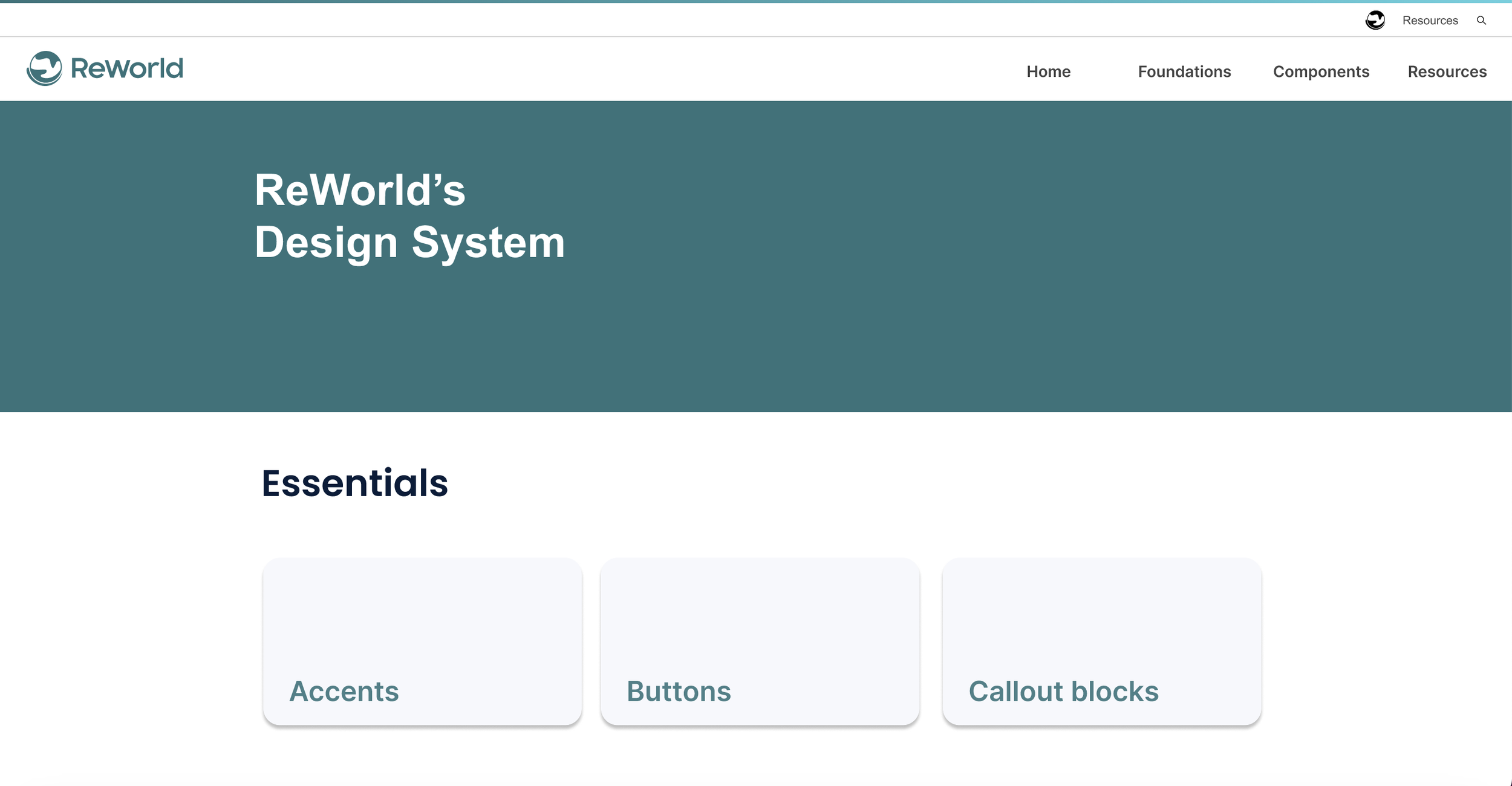
For this project I went a step beyond the design for desktop and created a mobile view of the wireframes, as well as components and iconography.
It was more of a mini design system along with documentation to describe the functionality in your prototype (developer handoff.)
Search Functionality…
Design System…
As an addition to the developer handoff, I created a mini design system for the components, colors and styles I used in the high-fidelity wireframes.